← Previous
Background
There’s a new player in the interior design game
Kelly Olson Interiors is a relatively new interior design business, specializing in remodeling, refurnishing, and decorating for residential interior spaces in and around the northwest suburbs of Chicago.
The Challenge
When Kelly launched her new business, she asked me to create a logo and website that complimented her sophisticated design sensibilities.
My Role
As the main art director/designer for this project, I’ve been providing direction and design in the development of Kelly’s logo, as well as design and development for her website.
In Progress
Currently, the website isn’t available to the public yet. It’s merely a working prototype, full of imagery that I’ve found on the Internet to establish a particular direction for how I envision the finished product to look. We’re in the process of pulling together finished content, and photographing her latest work.
Client:
Kelly Olson Interiors (Freelance)
Services:
Art Direction, Logo Design, Web Design & Development, UI Design, Content Strategy, Print Design
Credits:
Shutterstock – Photography
Process
Influences, sketches, and prototypes
Early on, Kelly shared a variety of examples of existing logos and websites that she believed could be a good source of inspiration to spark ideas. In her examples, I noticed a common theme in color scheme, imagery, and aesthetic that allowed me to hit the ground running once I began designing.


Logo Sketches:
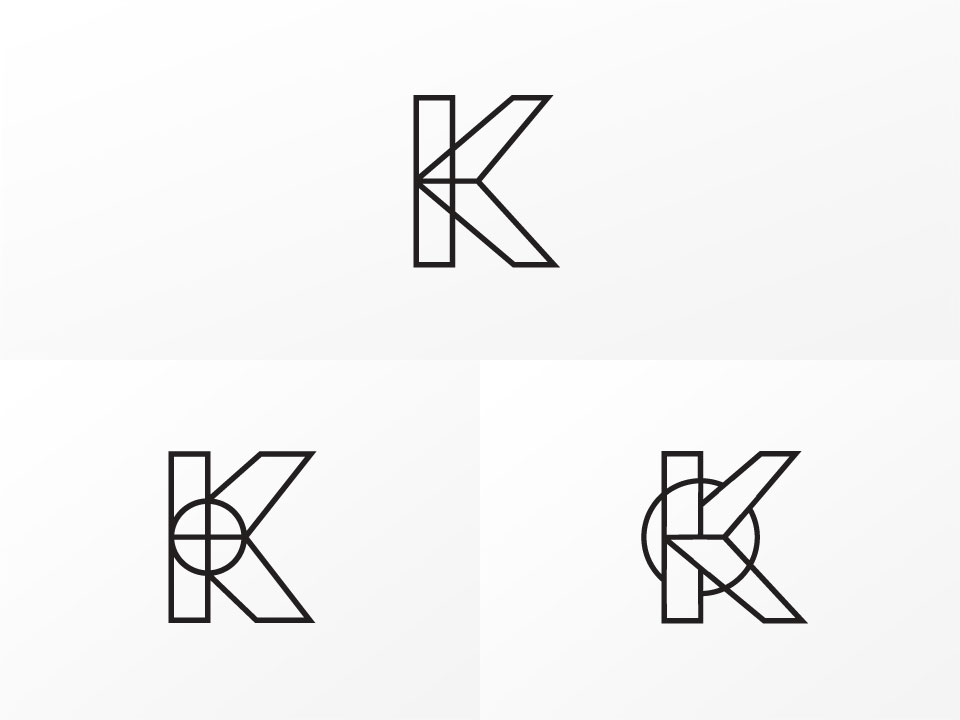
During the logo design process, I explored a variety of options for fonts and logotypes. Later, for the mark, the client expressed interest in using her initials, so I created a handful of different monogram options. The last slide is a more polished logo that I particularly liked, but was not chosen by the client.
Wireflow:
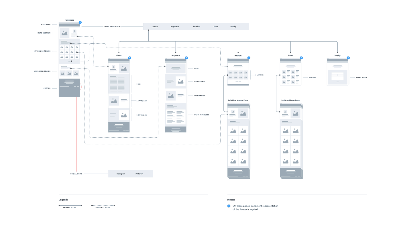
This diagram demonstrates the architecture of the information for the website. View larger PDF


UI Style Guide:
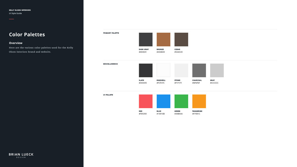
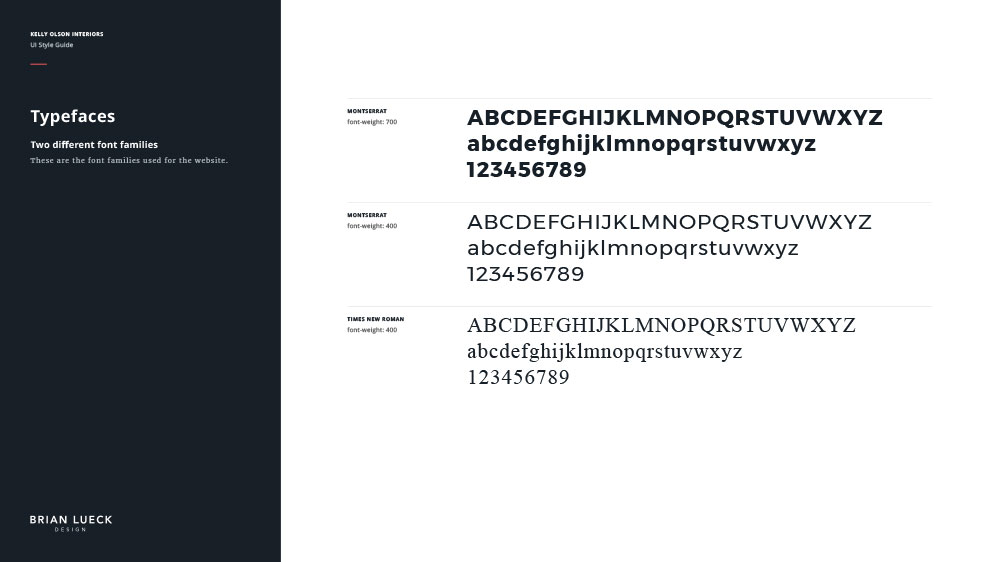
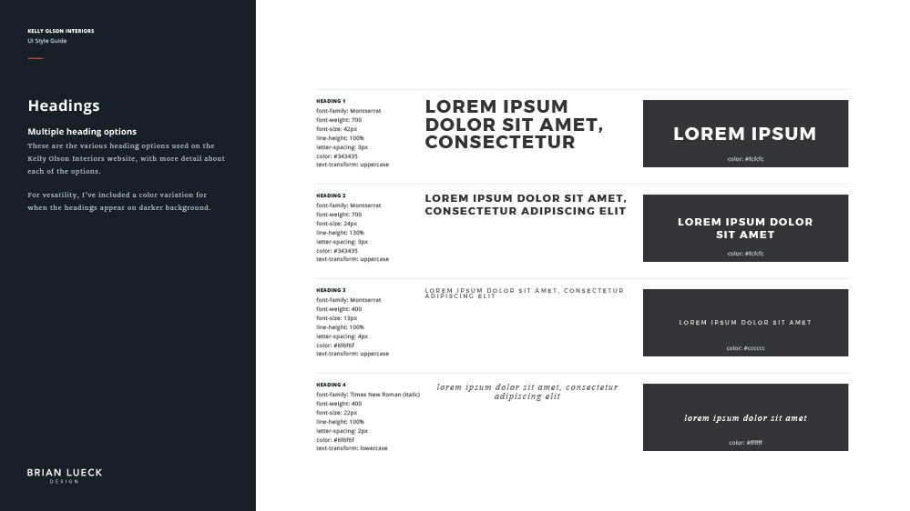
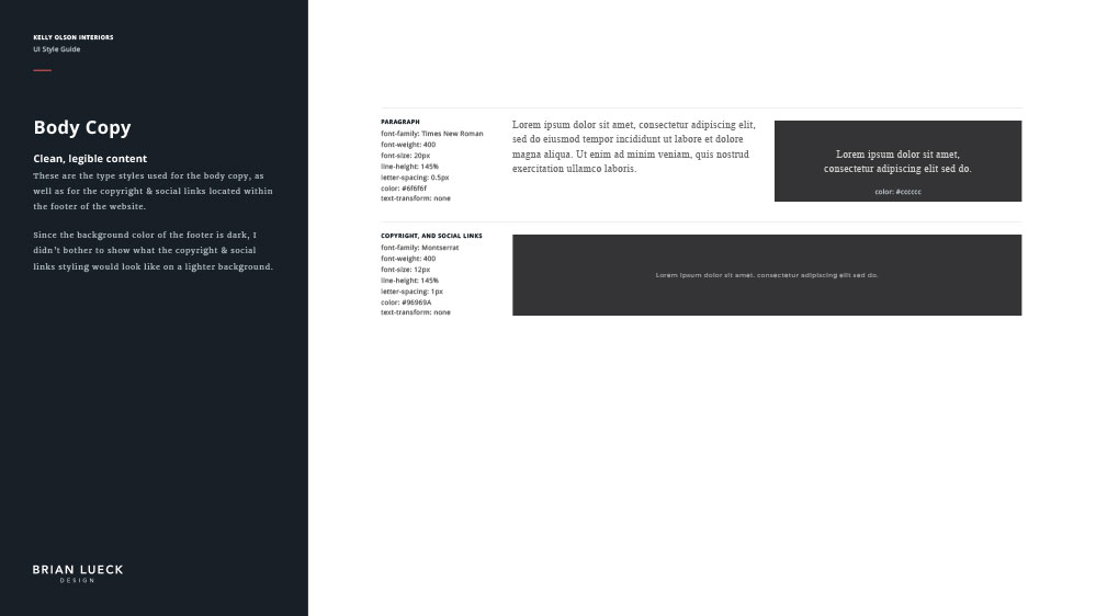
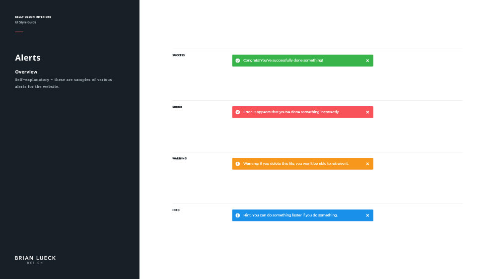
Here’s the style guide to further solidfy various brand and website details. View larger
Website Layout Inspiration:
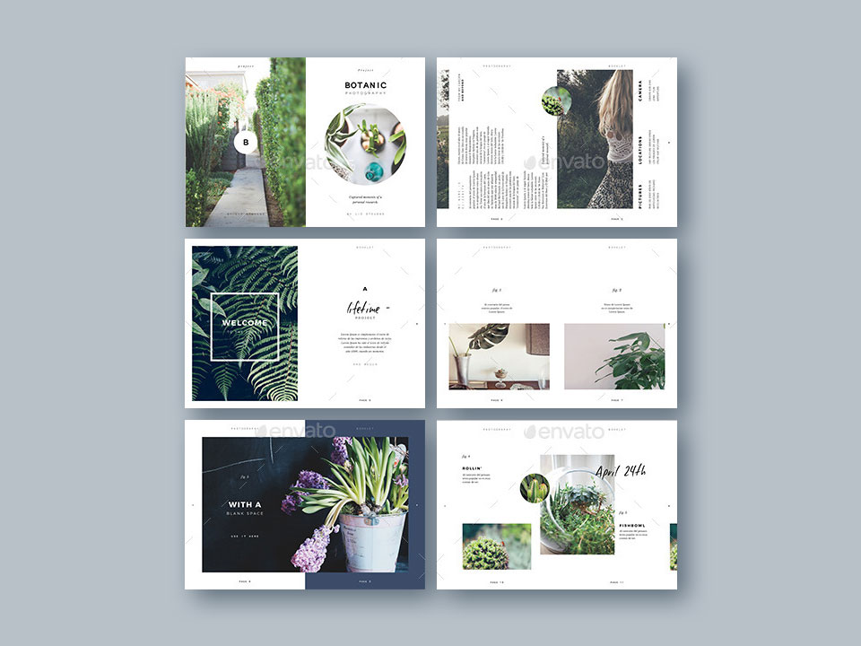
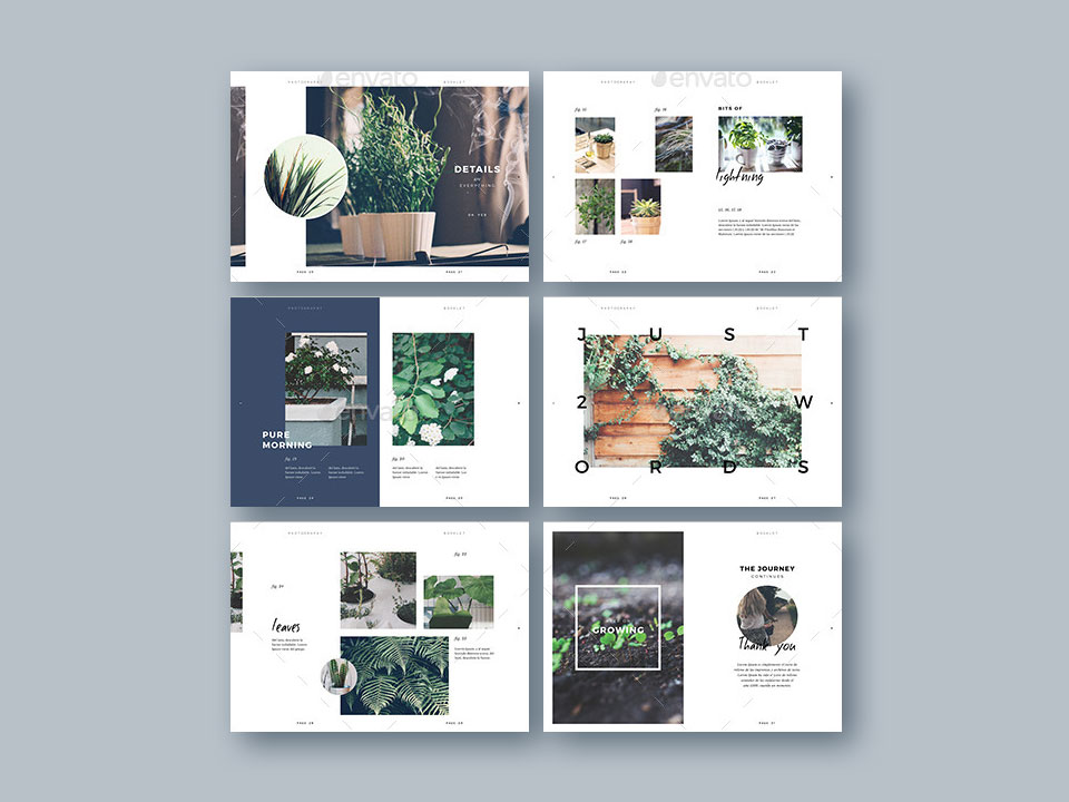
The website layout was based loosely on this brochure template from Envato that the client provided. Her goal was for me to capture the essence of the various spreads above.
Website Style Pages:
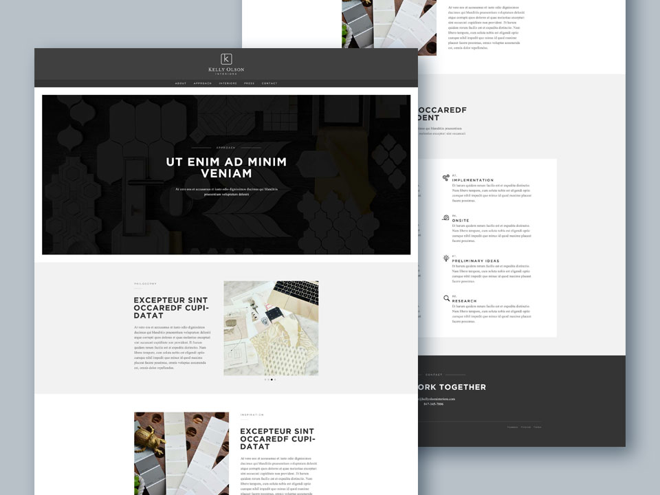
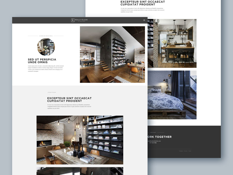
Using Photoshop, I created a handful of static style pages to demonstrate the direction that I wanted to persue for the website design.
Navigation Prototypes:
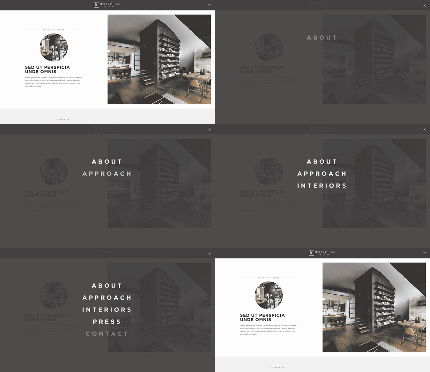
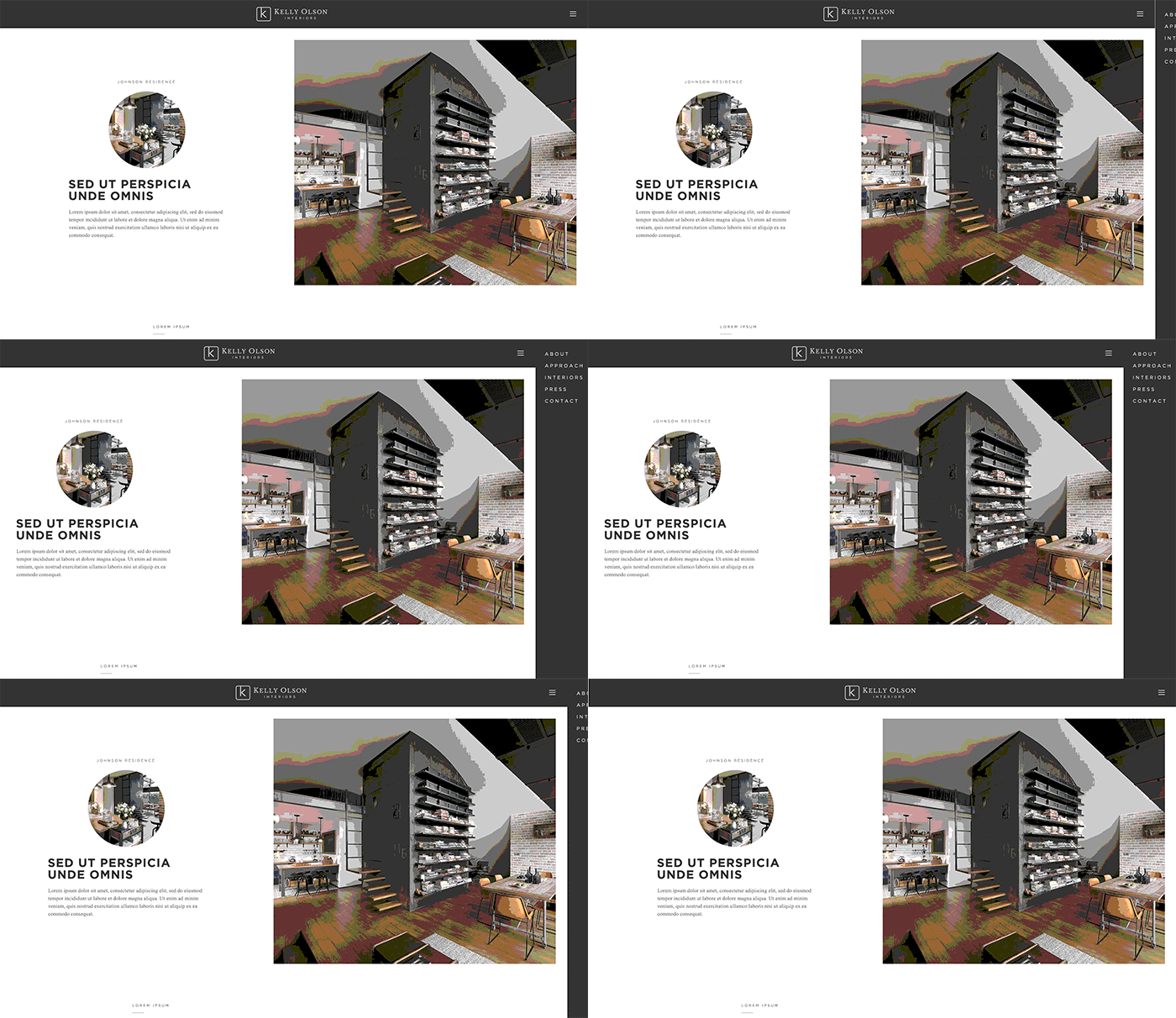
With low-fidelity animated GIFs, I mocked up a couple of rough prototypes to demonstrate a couple of ideas for the website navigation.
Icon Set:
These are icons that I created as a set for the website.


Photography Direction:
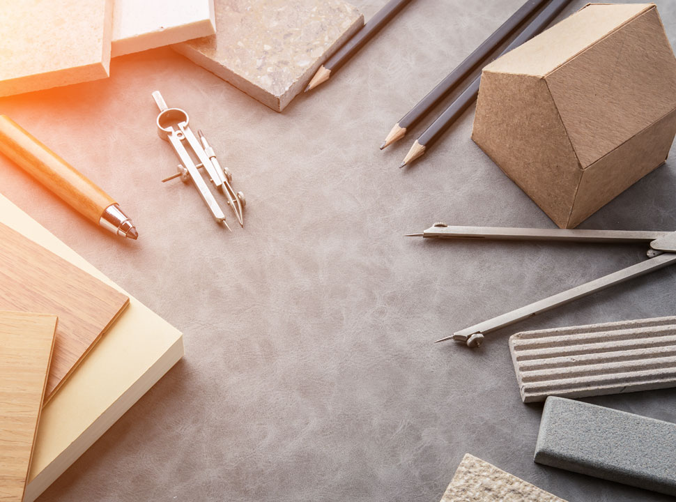
Small sample of the direction I want to use to demonstrate Kelly’s process, the details of her work, and the finished interiors. These are all found photos that I’m merely using to establish a direction.
Identity
A brand is born
Out of the handful of mark/logotype options that I provided, some were more creative than others, Kelly and I kept gravitating to the simplicity of the logo below. We felt that it was a clean representation of her budding business.
Chosen Logo:
After much deliberation, this the new logo that Kelly selected.
Business Card:
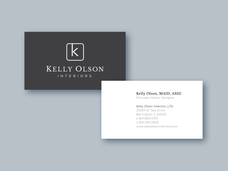
The business card design is clean and simple.
Website
Strong foundation for content and interactivity
As mentioned previously, this website is still a work in progress, but you can see below that I’ve developed a robust theme equipped with responsive page layouts, CSS animations, and AJAX page transitions. When the time comes, we can swap out the “filler” content for all of Kelly’s text and photos, then launch the website and make it available to the public!
Page Choreography:
This video demonstrates the desktop experience on the homepage, and particularly, the use of CSS animations and transitions to create a more polished product.
Page Transitions:
This video demonstrates how one page transitions to the next. My goal was to create a more fluid user experience.

Page Layout:
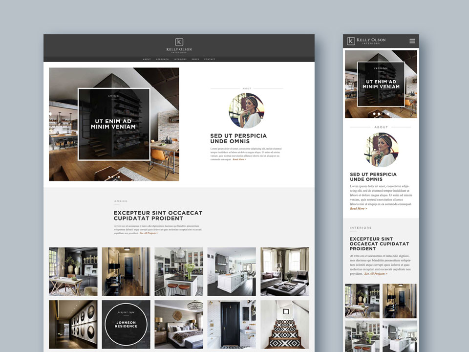
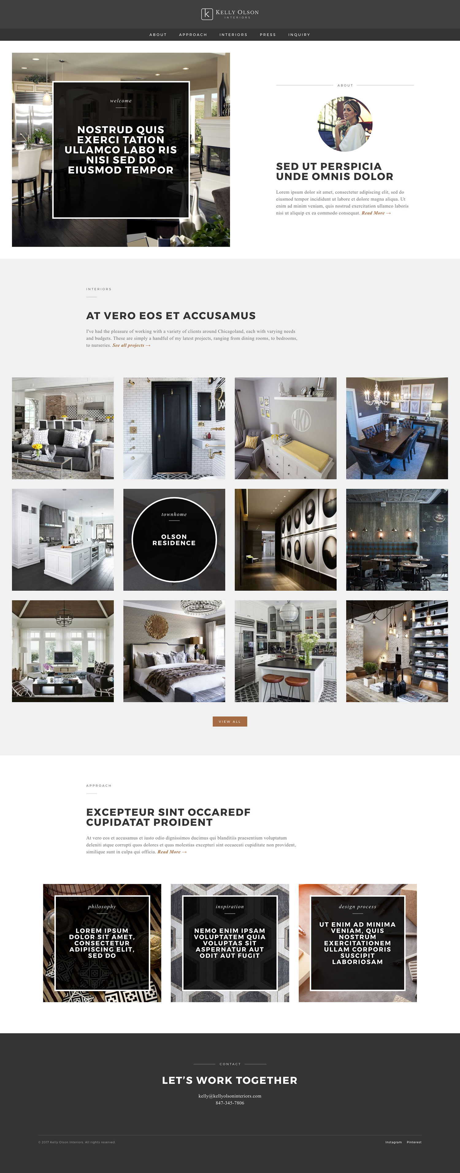
This is a static look at the page layout for the homepage, desktop view and iPhone view. Both of these figures are scrollable.
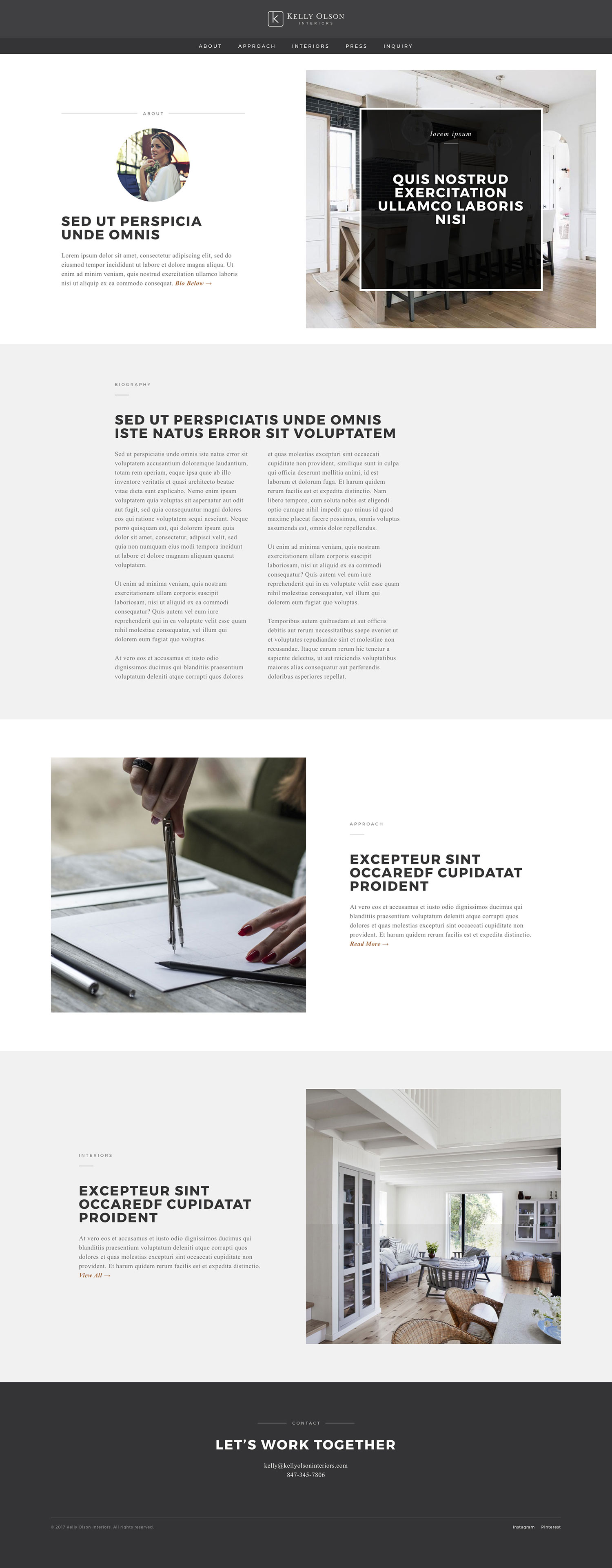
About Page:
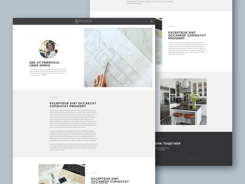
Using my static mockup as a blue print, I was able to accomplish the desired layout. This was a serious exercise in CSS. (scrollable)


