← Previous
Background
A design makeover for this Chicago-based law firm
Miller, Matthias & Hull (MMH) is a nationally-known intellectual property law firm in Chicago, Illinois, focused exclusively on patent prosecution and opinion services. Although MMH had experienced years of sustained success in the courtroom, in 2014, they were beginning to acknowledge that their online presence left a lot to be desired, especially when looking at a handful of their competitor’s websites.
The Challenge
MMH wanted a new website that established the company as an upper-echelon law firm. The client gave clear direction about using large beautiful photography to compliment all of the formal text that describes the nuances of their business. A couple weeks later, during the website’s design phase, the client wanted to give their existing logo a slight refresh, too.
My Role
I worked closely with the client to provide the art direction, design, development for the website redesign, as well as direction and design for the logo refresh. I also collaborated with the photographer, providing direction for a new series of headshots for everyone on staff at the firm. Lastly, I worked with their IT contact to transition the old website to the new.
Client:
Miller, Matthias & Hull LLP (Freelance)
Services:
Art Direction, Web Design & Development, UI Design, Content Strategy, Logo Design
Credits:
RJ Photo Galleries – Photography
John Bauché – IT / Hosting
Assessment
Evaluating old assets
The original MMH website was built in 2008. The “bones” were good, in that the website contained a lot of great text/content, however, the website wasn’t responsive, and it made use of Flash. Simply, the website didn’t provide a great user experience on mobile devices, and was in sore need of a design overhaul.
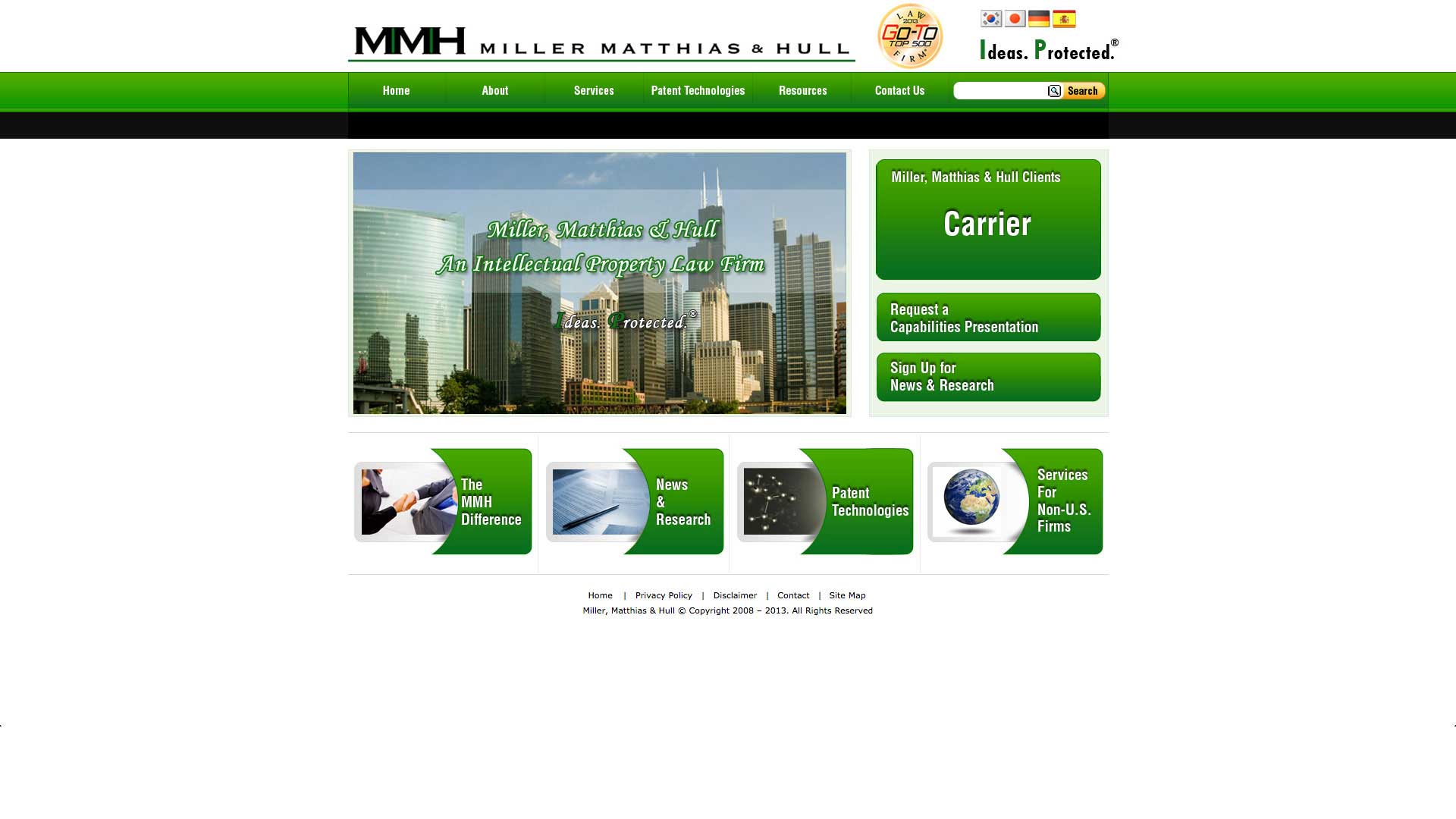
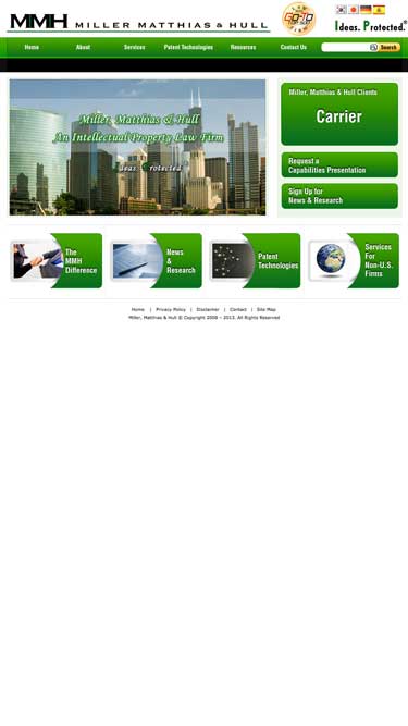
Original Website’s Homepage:
The homepage is oftentimes the first impression for any visitor. With a limited amount of content, I felt that MMH was missing an opportunity to accurately establish themselves as leaders in I.P. law. Aesthetically, there’s a handful of other design decisions that I’m not too fond of, including the lack of responsiveness, and the out-dated use of Flash.
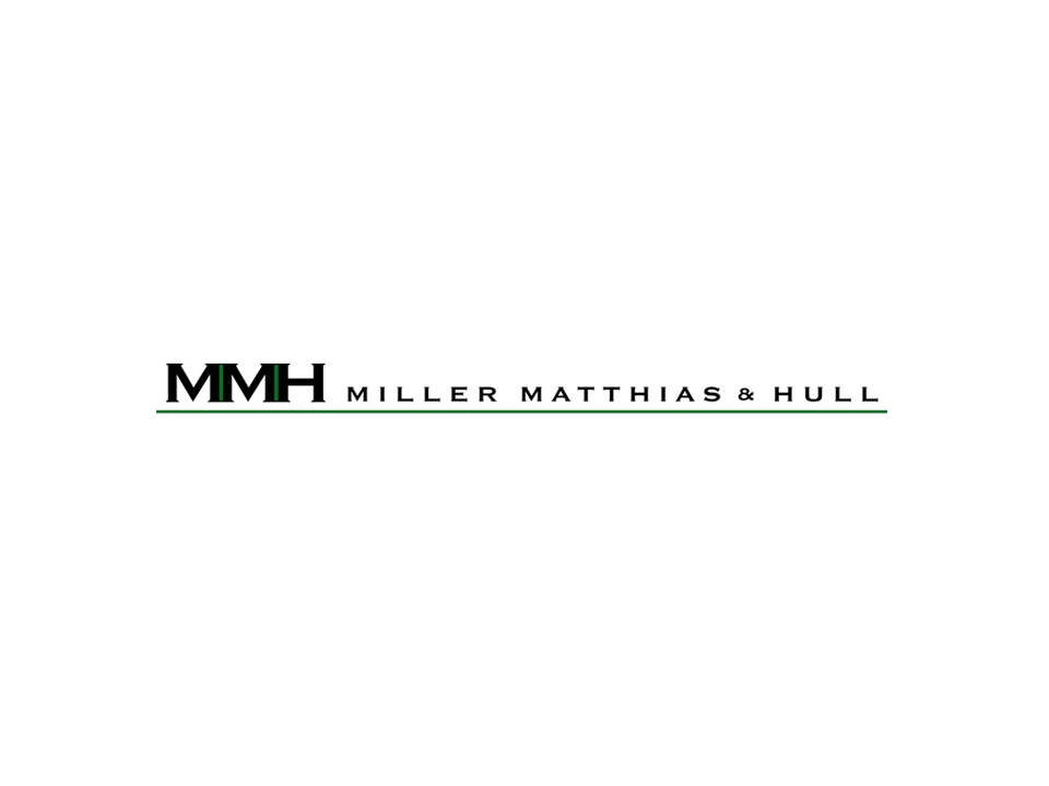
Original Logo:
This logo is serviceable. Copperplate Gothic wouldn’t be my first choice, but I understand why law firms gravitate towards this typeface. This was the only variation of MMH’s logo, so immediately, I was concerned about how this logo might translate on mobile devices, and wheter legibility might become an issue.
Process
(Fairly) Typical web design protocol
After understanding the client’s needs/desires, and after evaluating the old website, I began by laying out a new take on the sitemap, along with a website wireflow. Then, I designed 3 different “style” pages to help get a better read on the overall aesthetic the client was looking for. During the design of the website “style” pages, I noticed that the proportion of the original logo just didn’t fit the aesthetic that I was creating for the new website… so, I shoe-horned in a couple of tasteful logo explorations into my first presentation to the client, to gauge if he was open to the idea of a logo “refresh”.
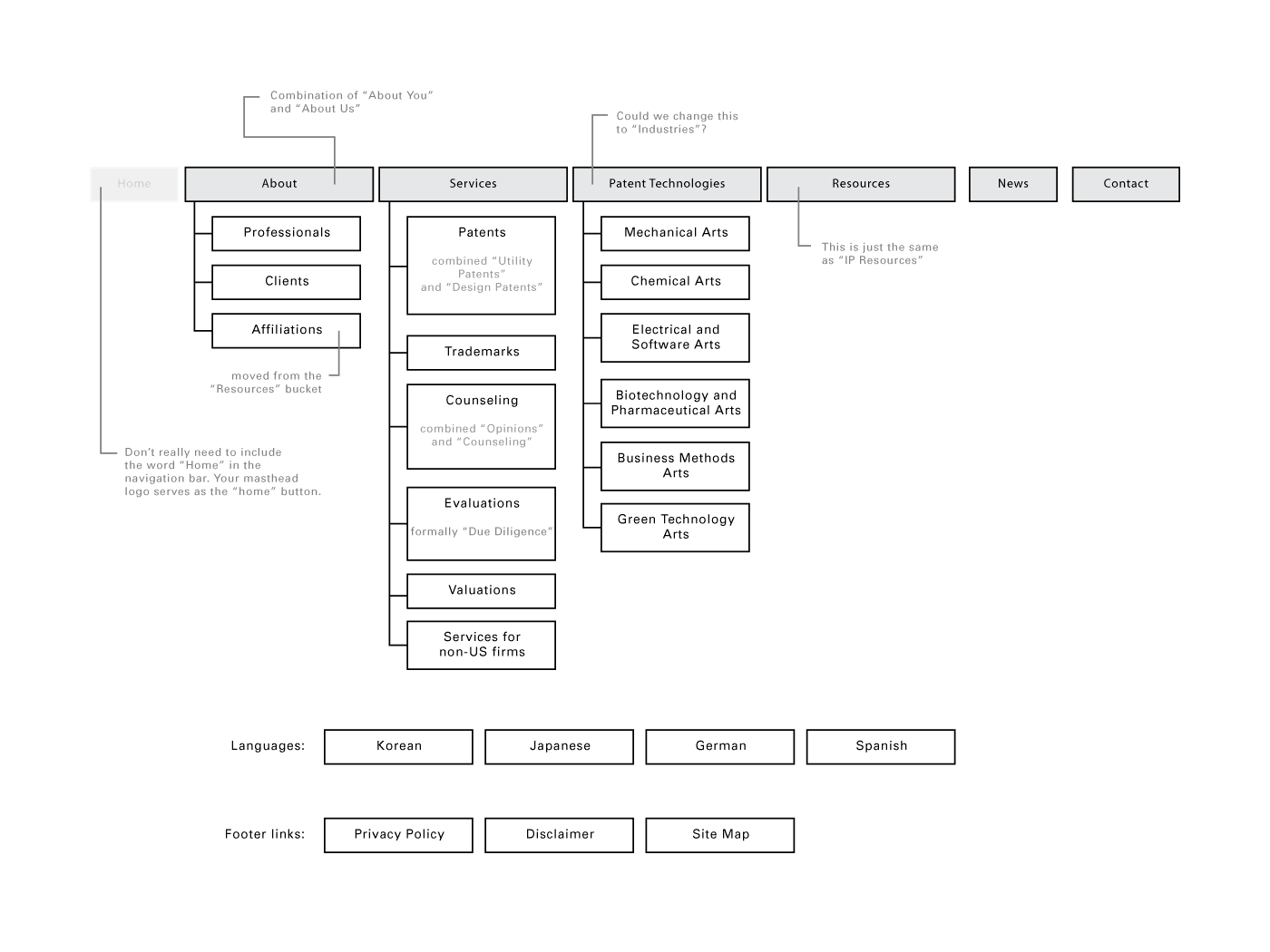
Proposed Sitemap:
For the new website, the client expressed interest in retaining a similar sitemap as the old website. I took that into account, and proposed this new sitemap. In the end, though, the client chose to go a different route.
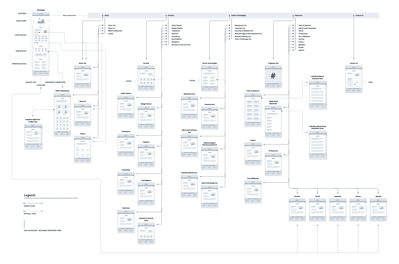
Website Wireflow:
This diagram demonstrates a loose gamplan for wireframes, while mapping out the user flow from page to page throughout the website. Wireflows can be a useful tool for information architecture. View larger PDF

Logo Refresh Options:
Since the client didn’t have an advanced identity system, I took the liberty of rearranging the monogram and logotype in a couple different ways to fit my “style” pages better. I was careful to be respectful to the client’s original logo.
Style Page Mockup – Scheme A:
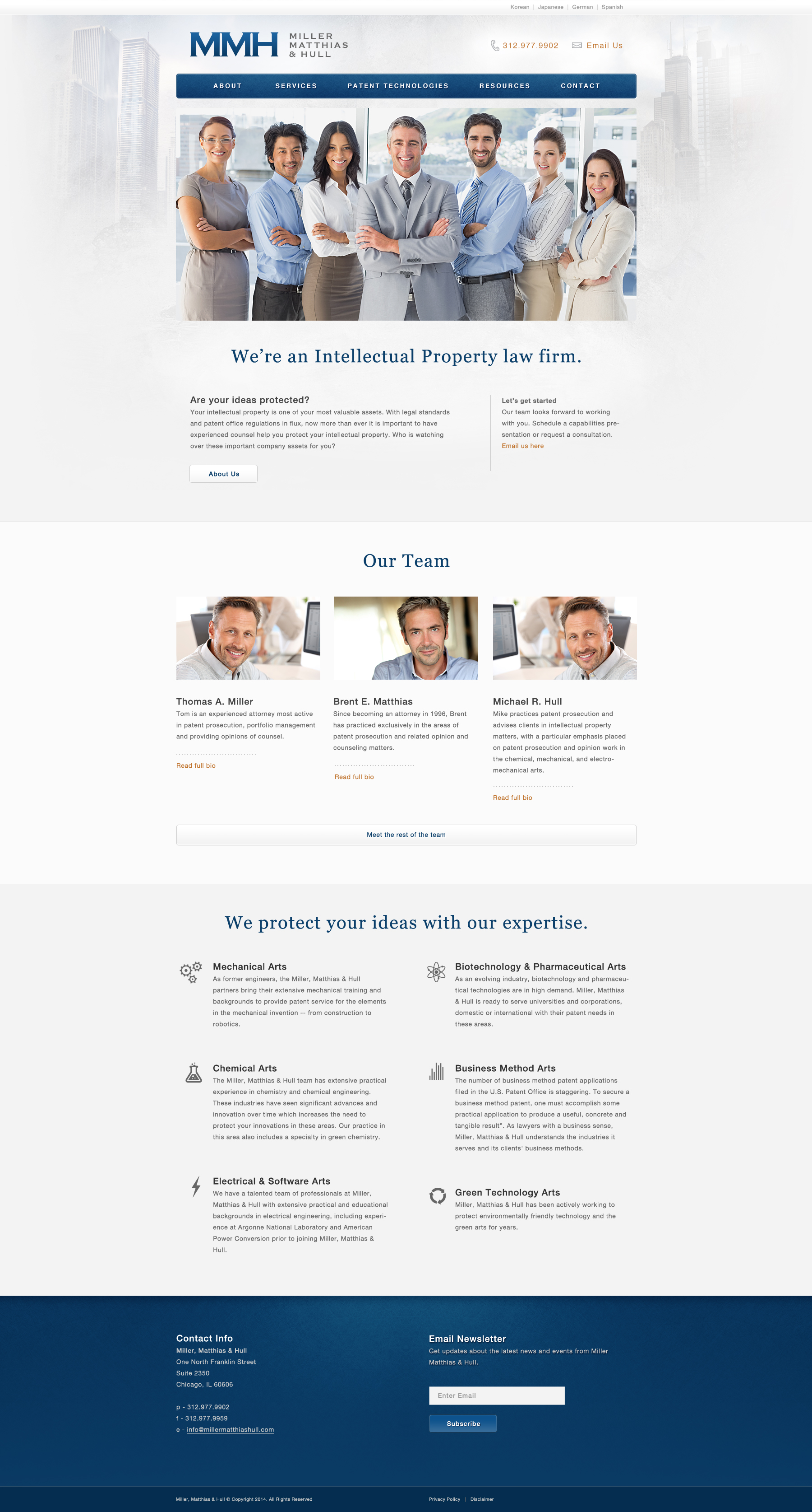
This scheme is light in tone, and abandons the green accent color in favor of a deep blue. I’ve incorporated some iconic skyscraper imagery to convey that this law firm is based in Chicago. Contact info is immediately available within the masthead. This scheme leads with large photo of a diverse group of professionals. (figure is scrollable)
Style Page Mockup – Scheme B:
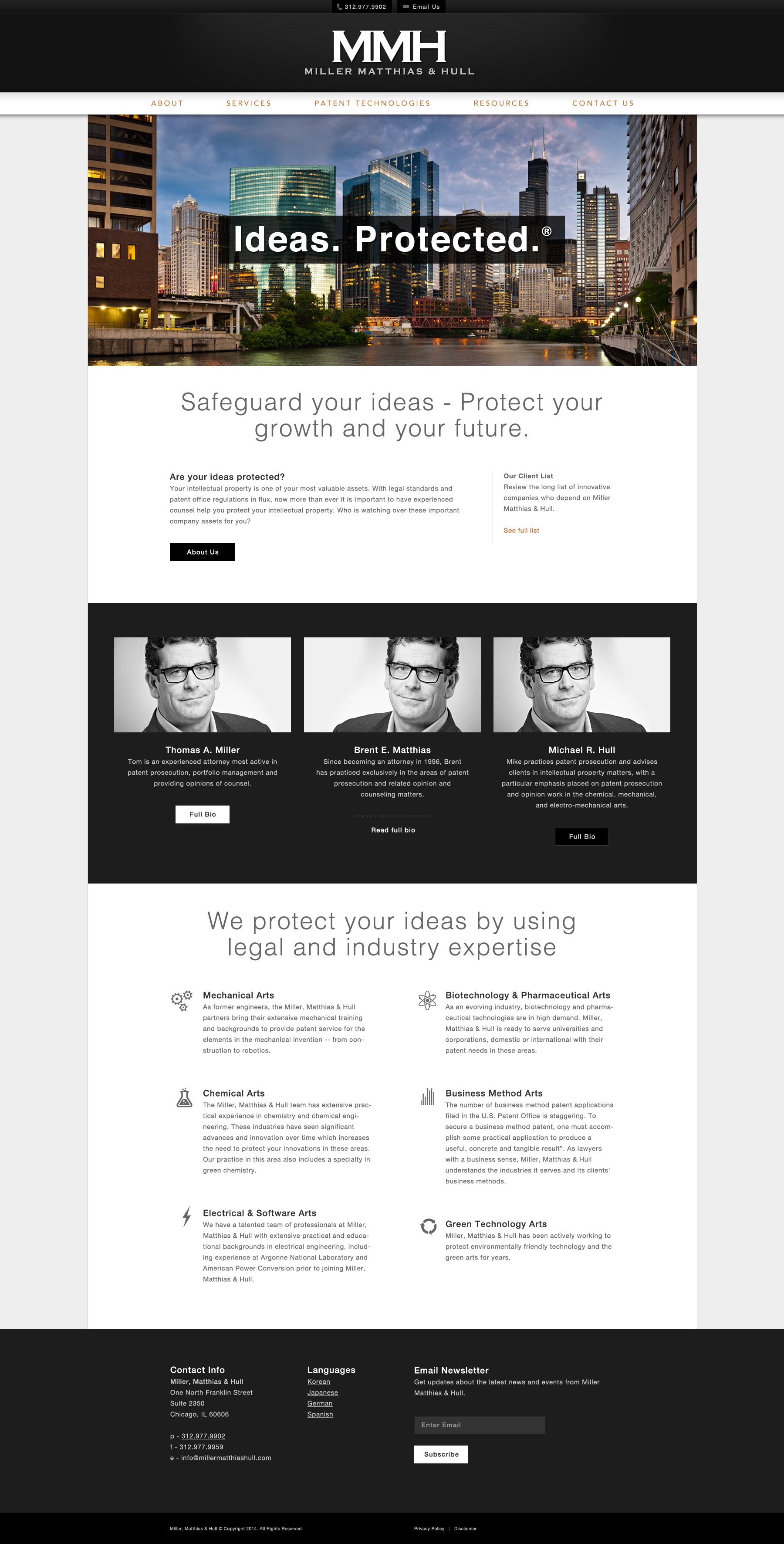
This scheme has a similar content structure/layout as Scheme A, but opted for the use of black to create a masthead that feels stylish and professional. Again, large hero photo, this time of the skyscrapers of downtown Chicago. Scroll down, and you’ll see that I opted for classic black and white photography for headshots of the partners. (scrollable)
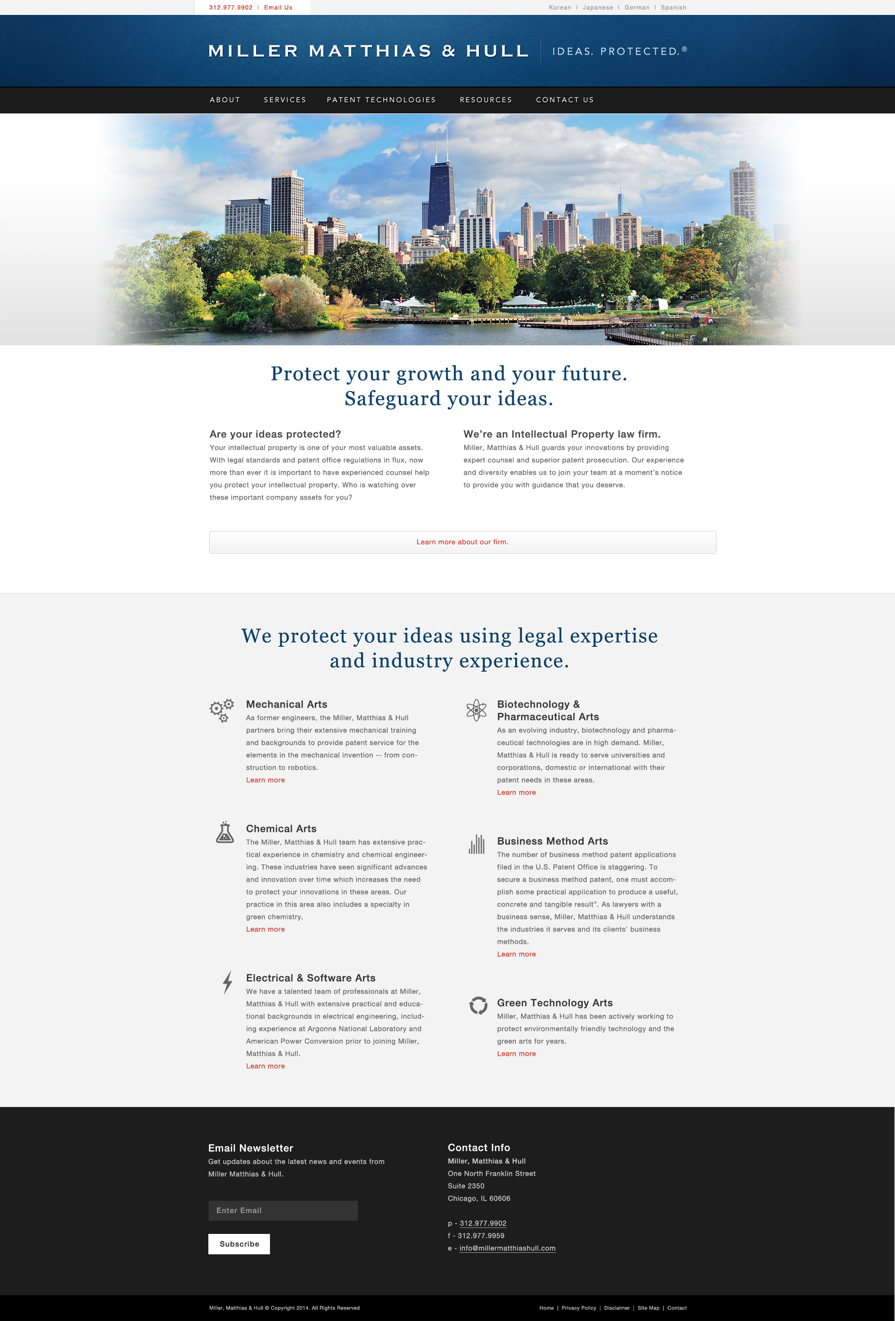
Style Page Mockup – Scheme C:
This scheme is a slight mash-up of Scheme A and Scheme B, combining some color aesthetics from one sceme with photography aesthetics from the other scheme. (scrollable)
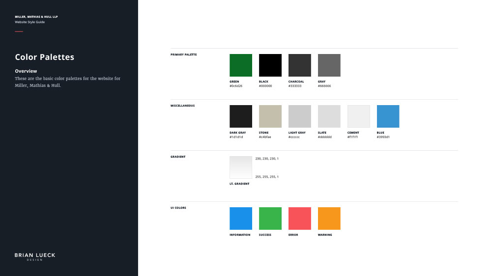
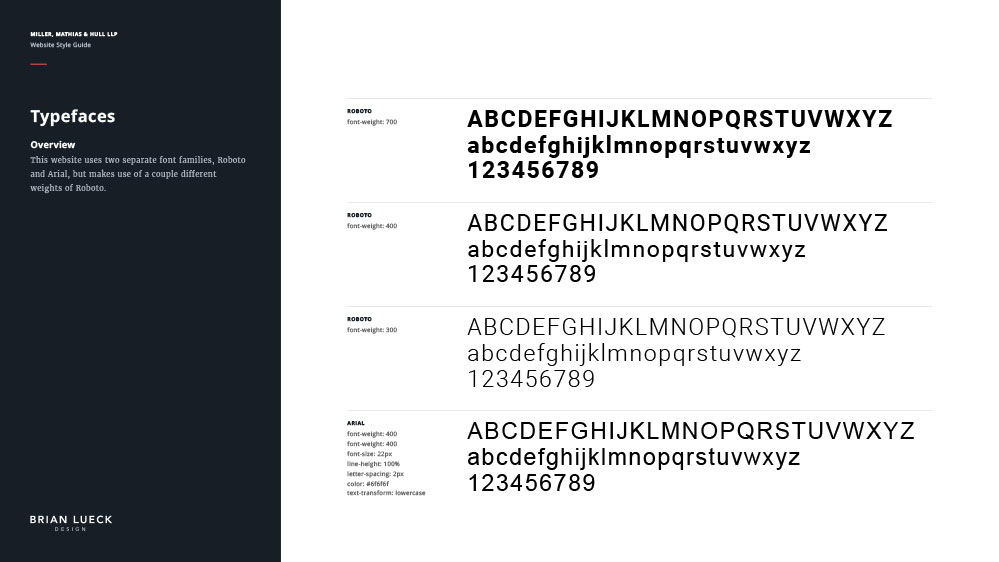
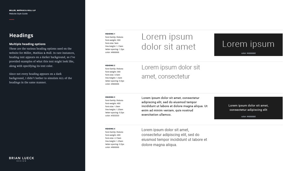
Website Style Guide:
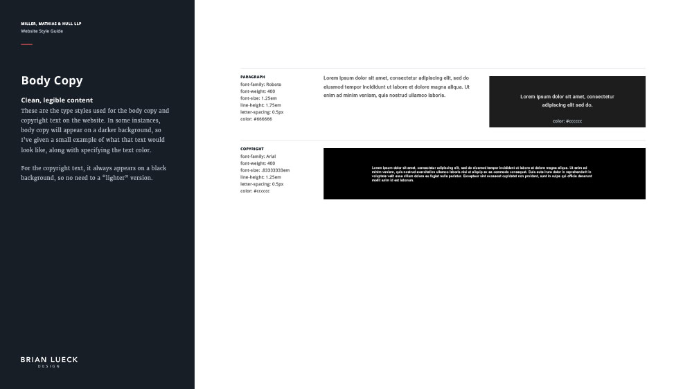
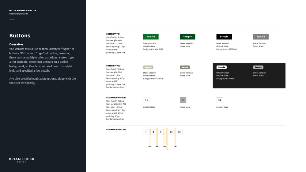
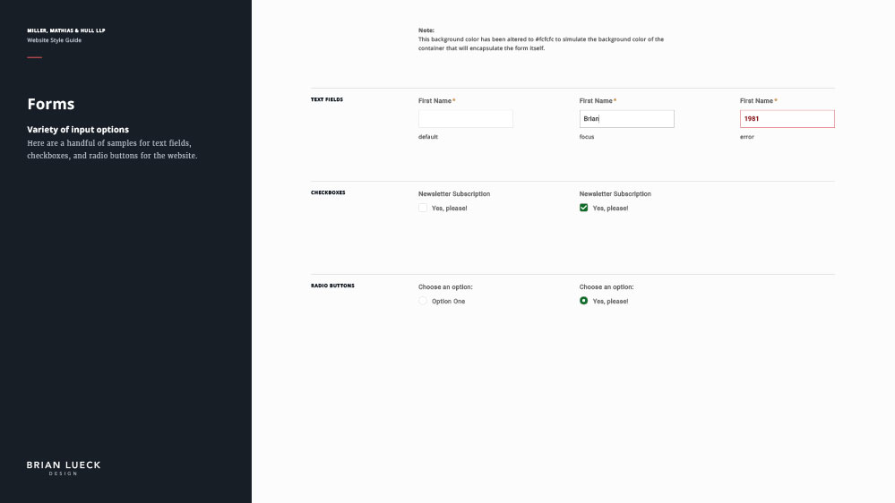
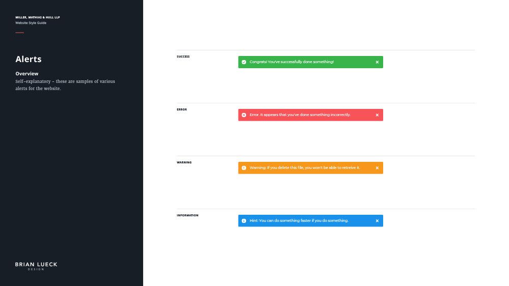
After a particular “style page” was selected, this is the style guide I created to cement a handful of the various website details. View larger


Website Imagery:
These are examples of the photography that I handpicked (from Shutterstock) to acheive a certain visual tone for my designs.
Logo Refresh
New and familiar
The client liked my rationale behind my logo sketches ↑, and was happy that I didn’t stray too far from the original logo. The client really liked the stacked option with the dark background… his only wish was to incorporate the green color that had been used on the original logo.
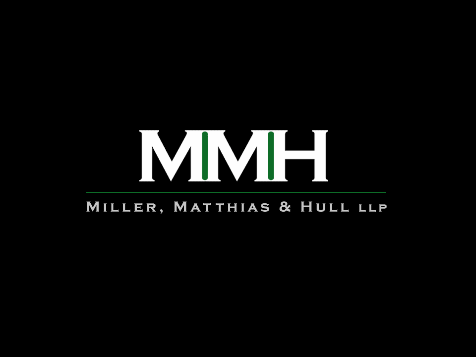
Finished Logo:
This is the new MMH logo… stacked cleanly, and calls back to details from the original logo.
Website Redesign
Modern, clean, responsive
The client loved all three of my website “style” pages, but he especially loved the color scheme and photography from Scheme B ↑. With a few minor tweaks to homepage content, I felt confident that I had all the direction I needed to build out the perfect website for MMH. Check out the screenshots below.
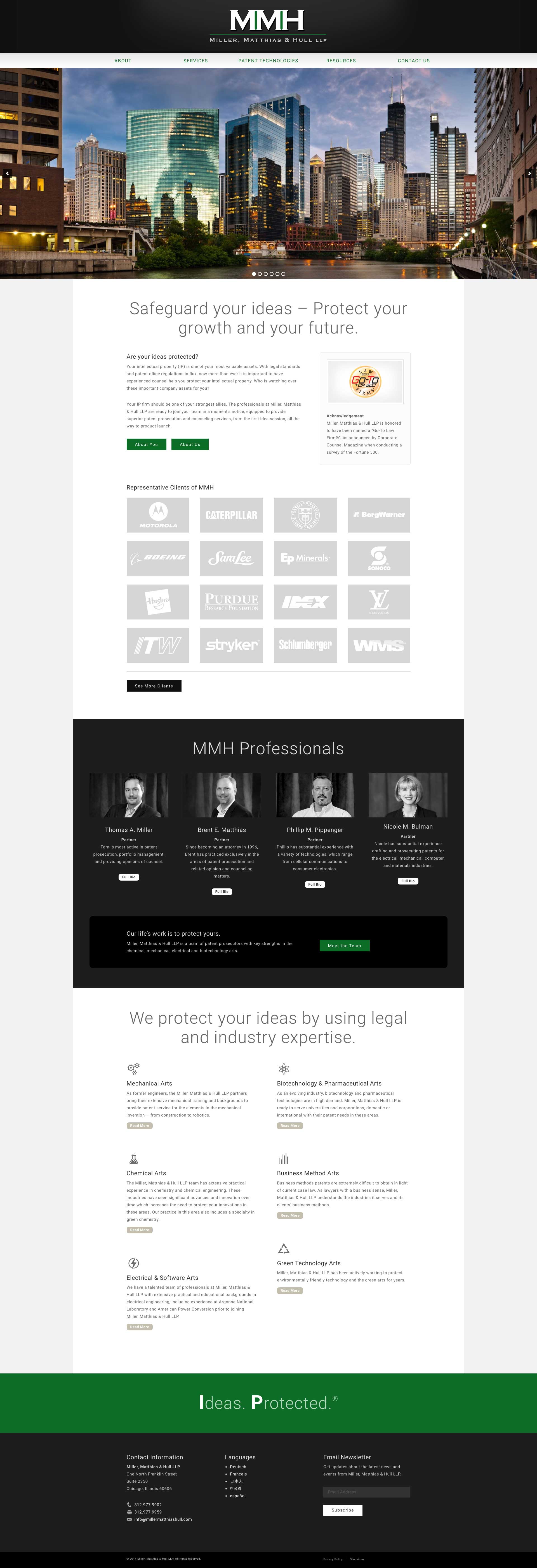

Homepage:
This website is fully responsive. Both of these figures are scrollable, helps to showcase the page layout.
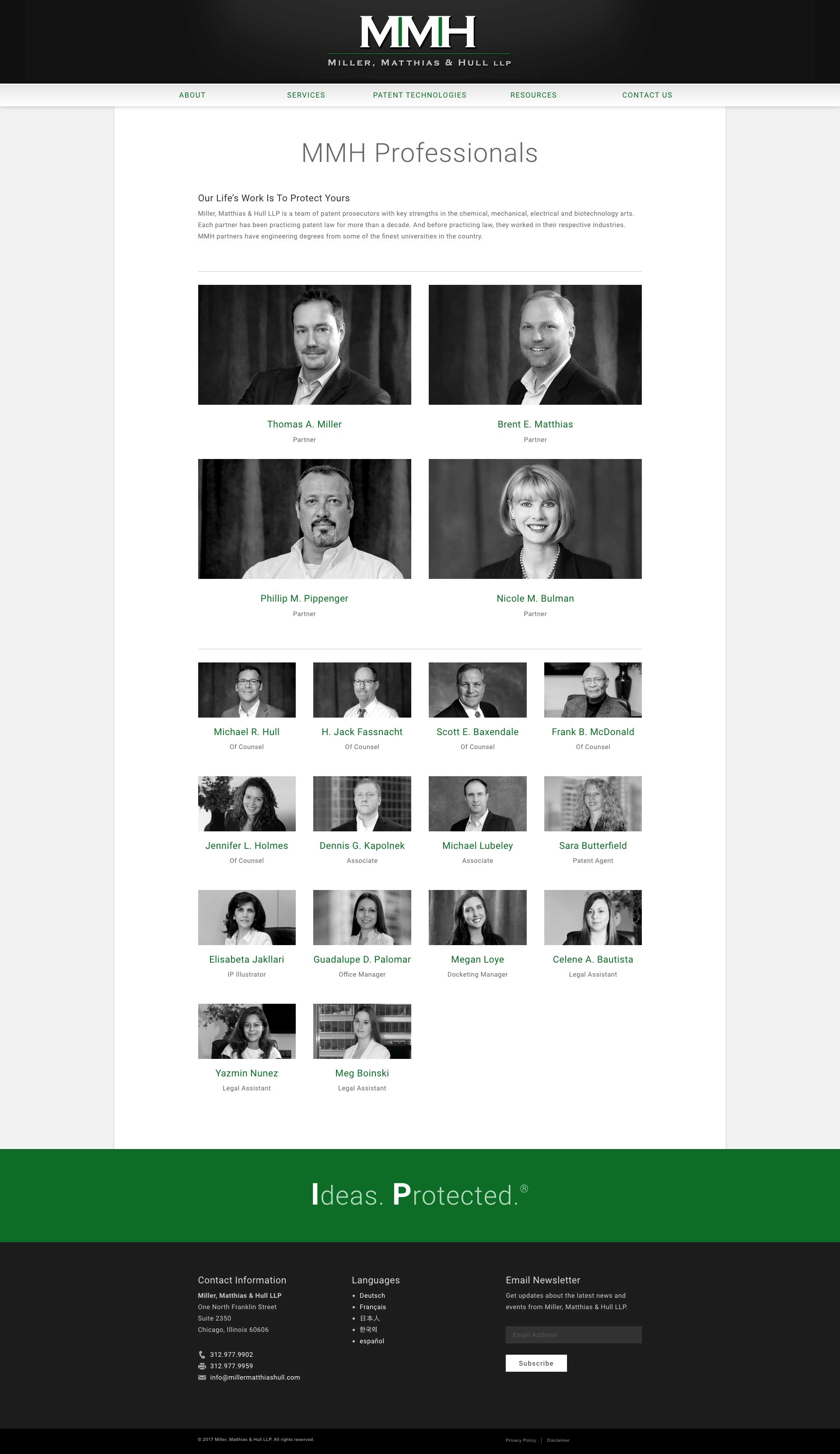

Interior Page Sample:
This is the MMH Professionals page, showcased in two different views to demonstrate responsiveness. (scrollable)


Results
Fantastic experience for all
From top to bottom, working with MMH has been a great experience, that ultimately led to the design of a website with great user experience… see what I did there? No, seriously, after we launched the new website, several people at MMH told me that they received a handful of compliments from people within their industry. I’m extremely happy with how everything turned out, I’m grateful that the client is proud of the product, and I’m thankful to continue to work with MMH today.