← Previous
Background
Building a brand for this young start-up legal company
Asbestos Disease, LLC is a small law firm in Chicago, providing legal counsel to the victims of mesothelioma and other asbestos-related diseases, along with guidance for the prevention of such diseases.
The Challenge
When looking at the current landscape of legal firms specializing in asbestos care, there’s an abundance of poorly-designed logos, and cumbersome websites that impede one’s ability to seek the care that he/she might be looking for. My client’s objective was to immediately establish themselves high-end, trustworthy company through well-conceived branding, and to then build a website that allowed victims to quickly receive the care and representation that they need.
My Role
I worked closely with the client to provide the art direction, design, development for the new company branding, the new website, and other promotional & marketing pieces.
Client:
Asbestos Disease, LLC (Freelance)
Services:
Art Direction, Logo Design, Web Design & Development, UI Design, Content Strategy, Print Design
Credits:
Shutterstock – Photography
Process
Sketch, design, deploy
After the initial consultation about the scope of this whole project, I turned to my sketchbook to create some ideas for the logo. Then I began designing the website, unfortunately, there isn’t a lot of documented sketches for the website because we had such a tight deadline, so in essence, we were “painting with a very wet brush” as we made quick decisions regarding layout, imagery, and icons. After we launched the website, I began designing the promotional brochure so that the client could have some kind of marketing/informational tool to share with those in need.
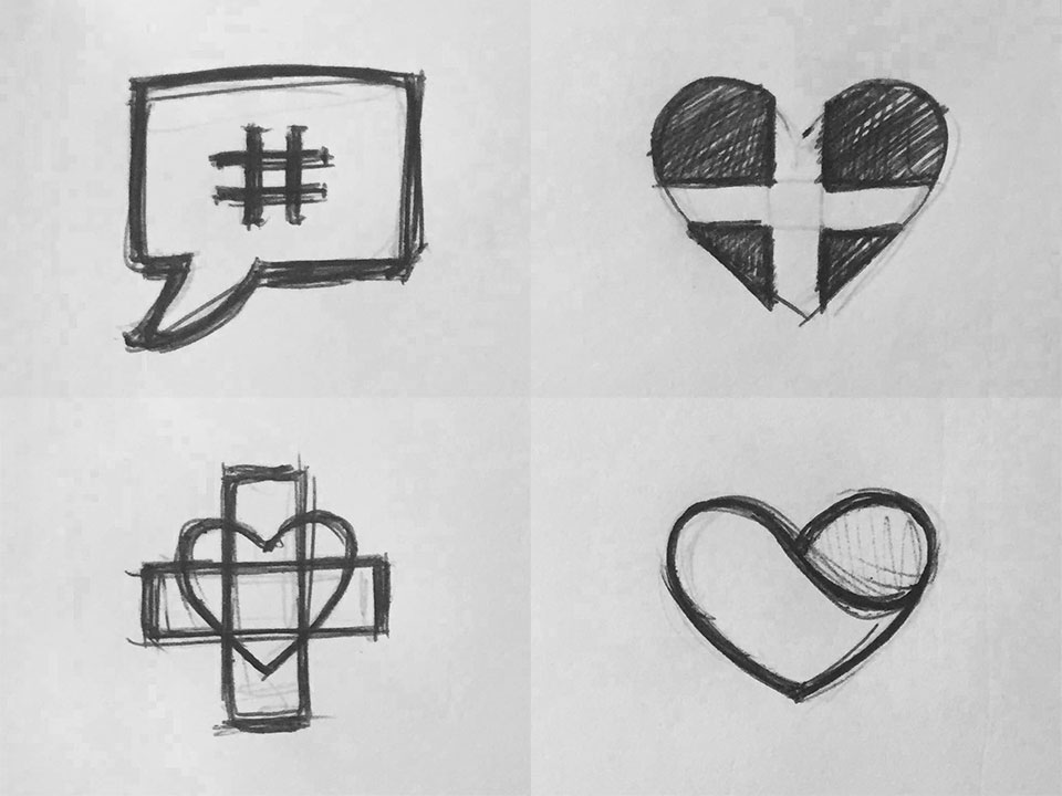
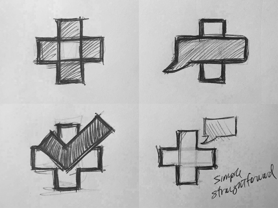

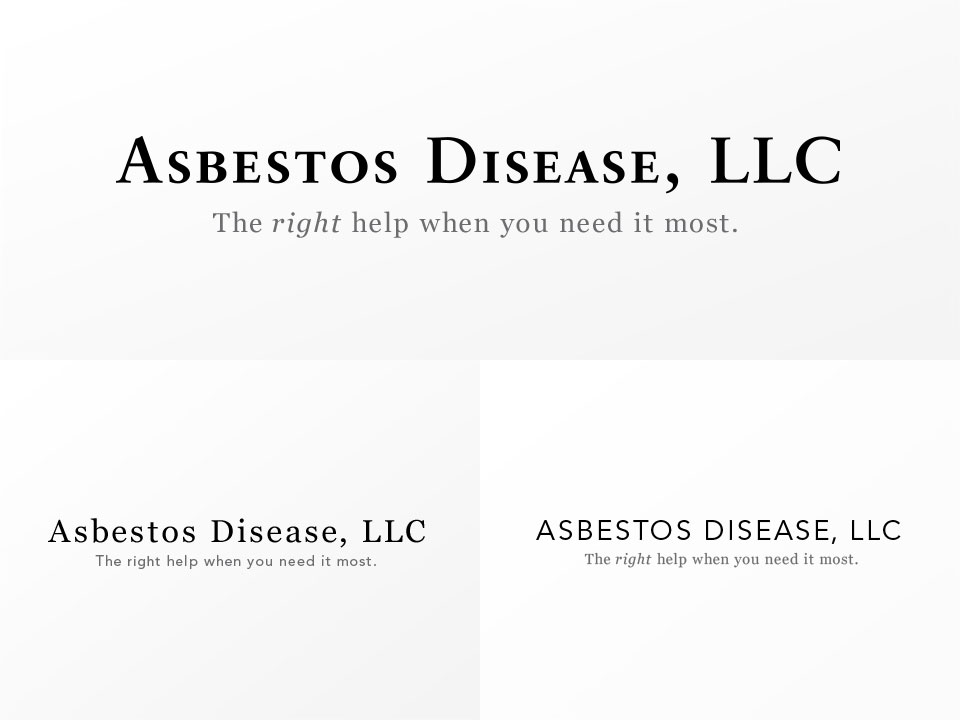
Logo Sketches:
In most sketches for the mark, I gravitated towards the use of a talk bubble to signify the counsel that this company provides. For the logotype, I was looking for something classic, clean, and something that felt “trustworthy”.


Brand Imagery:
These are examples of the photography that I handpicked (from Shutterstock) to acheive a certain visual tone for my designs on the website and on the brochure.
Icon Set:
These are icons that I created for the website and for the brochure. A couple icons are original, while a couple were taken from Shutterstock, and tweaked to fit better within the whole family.
Logo
Conveying helpful counsel
This mark and the color scheme clearly communicate the medical/counselling nature of Asbestos Disease, LLC. The chosen font for the logotype is a great compliment that balances out any “juvenile” charactistics that may be perceived by the mark alone, creating a finished product that is modern, sophisticated, and professional.
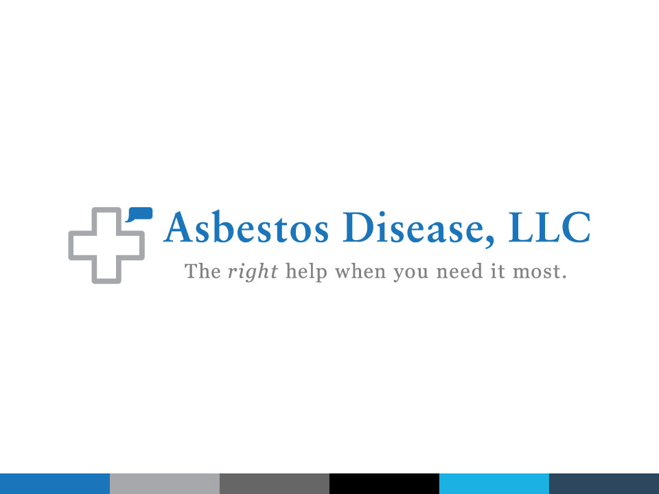
Finished Logo:
This is the new logo for Asbestos Disease, LLC. I’ve also included the chosen primary and secondary color swatches.
Website
Help is just one touch away
The client’s main objective for this website was to enable users to make contact quickly and efficiently. We acheived this by incorporating the phone number and email prominently into the masthead, as well as by adding a “general inquiry” form to the sidebar of every page. Also, to further establish Asbestos Disease, LLC as a leader and a source within it’s industry, we included a “blog” where the client can create content that provides meaningful and timely info about prevention and counsel.
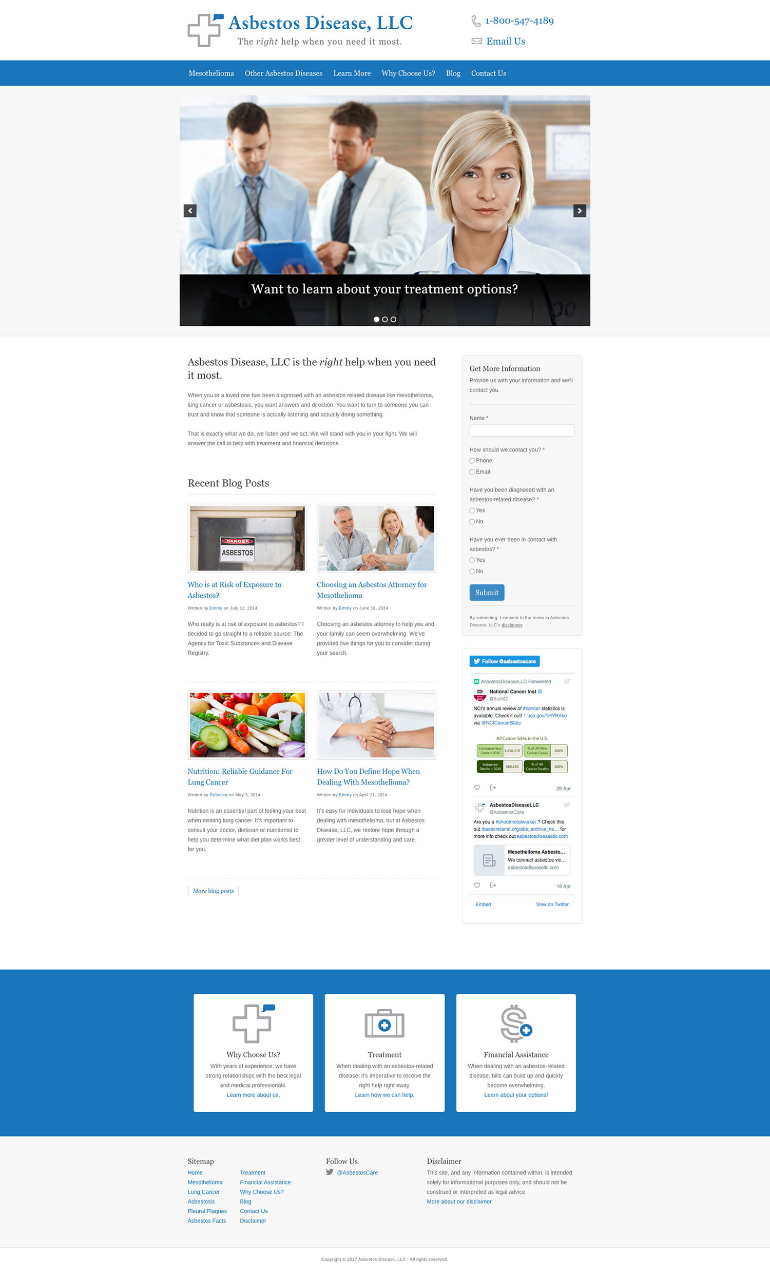

Homepage:
This website is fully responsive. Both of these figures are scrollable, helps to showcase the page layout.
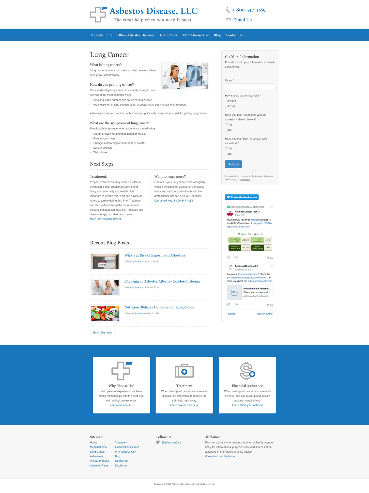

Interior Page Sample:
Another exmaple to demonstrate responsiveness. (scrollable)


Brochure
Extending the brand further
The client needed an informational brochure to share with prospective clients at various conventions for asbestos disease care. I worked with the client to tailor the message to design a brochure that compliments the brand’s other aesthetics.

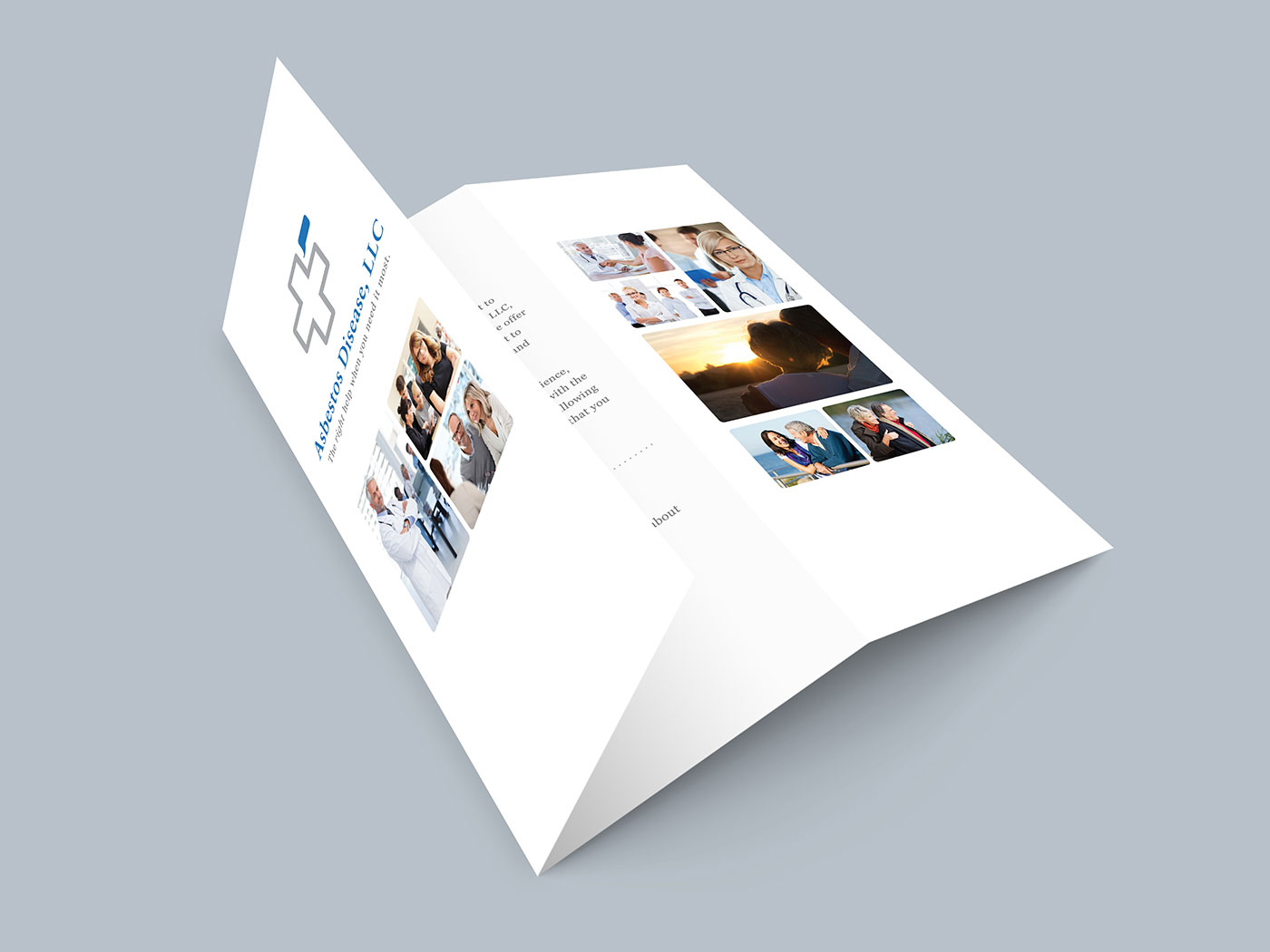
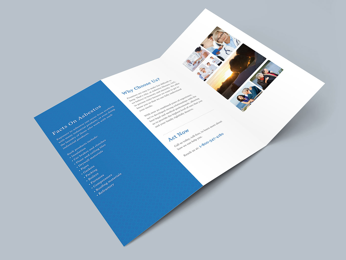
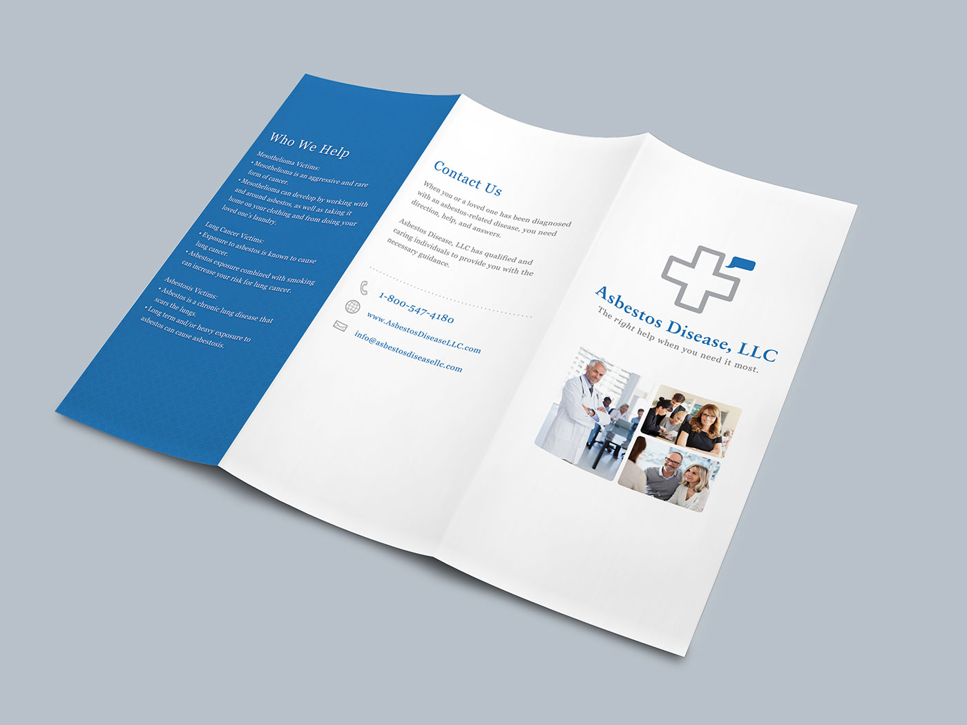
Promotional Brochure:
Handful of views of the promotional brochure.